by Mary Bailey
What makes a kitchen stand out? What makes a kitchen livable and functional? What makes a kitchen design timeless?
These were the questions our judges wrestled with as they looked at over 30 spaces to choose the top kitchens in our second annual Tomato Kitchen Design Awards.
[doptoggle title=”Judges” icon=5 activeicon=6]
 Darrel Halliwell Darrel Halliwell Darrell Halliwell is an architect and managing principal for DIALOG’s Edmonton Studio. He is a member of the firm’s leadership team, responsible for strategic direction and management of the firm across Canada. dialogdesign.ca |
 George Ilagen George Ilagen George Ilagan, a partner at Hastings Ilagan Design, is an architect by training and passionate about design. George has designed a myriad of kitchens, ranging from the simple to the sublime. hastingsilagan.ca |
 Michele Roach Michele Roach Michele Roach, principal and co- owner ofWolski Design Group— one of Edmonton’s top interior design firms—is a minimalist-design pioneer, animal print enthusiast and self-proclaimed “creative problem solver with a soft spot for logistical nightmares”. wolskidesign.com |
[/doptoggle]
First Prize
 |
 |
 |
 |
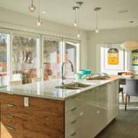 |
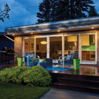
The renovation transformed a cramped and outdated kitchen into a modern-day showpiece. We kicked things off by gutting the space, blowing out the back wall and adding a contemporary style quad sliding patio door.
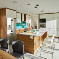
The original flooring was replaced with large grey porcelain tile, and the space was sectioned off into two rooms, a kitchen and dining room that flow seamlessly into one another. In keeping with a mid-century aesthetic, the custom cabinetry is a combination of high-gloss white upper cabinets and horizontal-grain walnut lower cabinets.
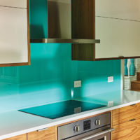
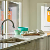
The vibrant aqua back-painted tempered glass backsplash adds a punch of colour. The kitchen island and countertops are in a stunning white quartz. Inspired by mid-century design and infused with 21st century amenities, this kitchen is now a beautiful and functional space with chic style.
Designer/Builder
Revington Renovations
Category
Residential Renovation < $300K
What the judges said
“Very nice material vocabulary, clean simple layout, easy space to work in.”
“Great relationship of the dining, kitchen and outside patio.”
“Reno complements a mid-century house without being a mid-century reproduction.”
“A nicely detailed light-filled space with refined hardware.”
Second Prize
 |
 |
 |
 |
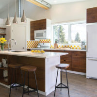 |
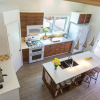
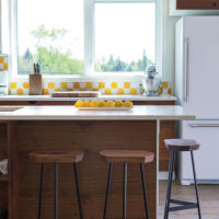
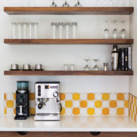
This kitchen was an infill project in Parkview: the owners removed the roof of their 1950’s bungalow to add a suite for multigenerational living. The kitchen size is under 200 square feet, due to the small footprint of the bungalow, but still needed to function well for cooking, baking and casual seating.
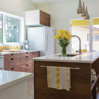
Budget-friendly white appliances were chosen for a light and fresh look. To fit the modest budget, but also to create a modern aesthetic, Ikea base cabinets and gloss-white cover panels were finished with book-matched solid walnut door and drawer fronts made by a local carpenter. A functional cutaway handle profile was designed for the drawers to minimize hardware, and an open shelf and back panel were designed to finish the island without the need for any additional cabinetry.
Designer/Builder
Joshua Kupsch, Land Faculty
Category
Residential Renovation < $300K
What the judges said
“Bright and fresh, a place I’d like to hang out.”
“A playful fun kitchen on a modest budget.”
“I like the choice of colour and wood with the white.”
Honourable Mention
 |
 |
 |
 |
 |
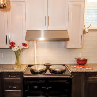
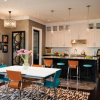
Our kitchen is the central hub in our home. We designed it, acted as our own general contractor and decorated the end result. It was the hardest thing we have ever done.
Designer/Builder
Deborah & Eric Anzinger
Category
Residential Renovation < $300K
What the judges said
“Love the pantry! Especially the lighting fixture.” “Stupendous appliances.”
“Like the use of colour in the furniture, appointments, artwork and carpet.”
Third Prize
 |
 |
 |
 |
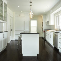 |
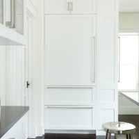
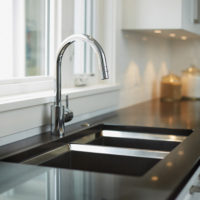
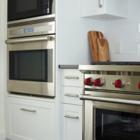
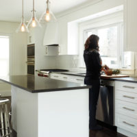
With a white-on-white kitchen, it’s all about the details. Take a closer look and you’ll see that each window and interior door was framed with custom-trim work. The glass interior doors leading into the hallway and dining room were salvaged, repaired and refinished. A large, energy-efficient window was installed, along with LED pot lights and pendants, to brighten the space and highlight crisp white cabinetry. This renovation transformed the original 1950s yellow kitchen into a well-designed space with classic tailoring.
Designer/Builder
Revington Renovations
Category
Residential Renovation < $300K
What the judges said
“Beautiful, pristine ambience, a classic Canadian kitchen.”
“Lights over the island are great and well suited to the space.”
“ As an island buff, this one is almost perfect as a multifunctional piece of millwork. The overhang could have been six inches deeper.”
Honourable Mention
 |
 |
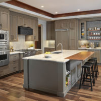 |
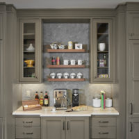
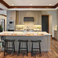
This Avanti show home kitchen in Windermere was Frank Lloyd Wright inspired, with a mix of woods, paints and natural stone finishes.
Designer/Builder
Rebecca Gagne, Cucina Bella Ltd.
Category
Residential New Build < $300K
What the judges said
“Nice work flow, a perfect triangle, and the coffee nook is a nice touch.”
“Beautiful stone work, especially the herringbone backsplash.”
“Recessed ceiling is an added bonus as it helps the scale of the room.”